
Traverse Hiking App:
UI/UX Purposeful Redesign
Summary
A hiking app redesign focused on improving user experience, interface accessibility, and brand identity. The project refined navigation, improved clarity, and introduced a new name, logo, and brand kit—creating a cohesive and distinctive brand identity.
New Brand Kit
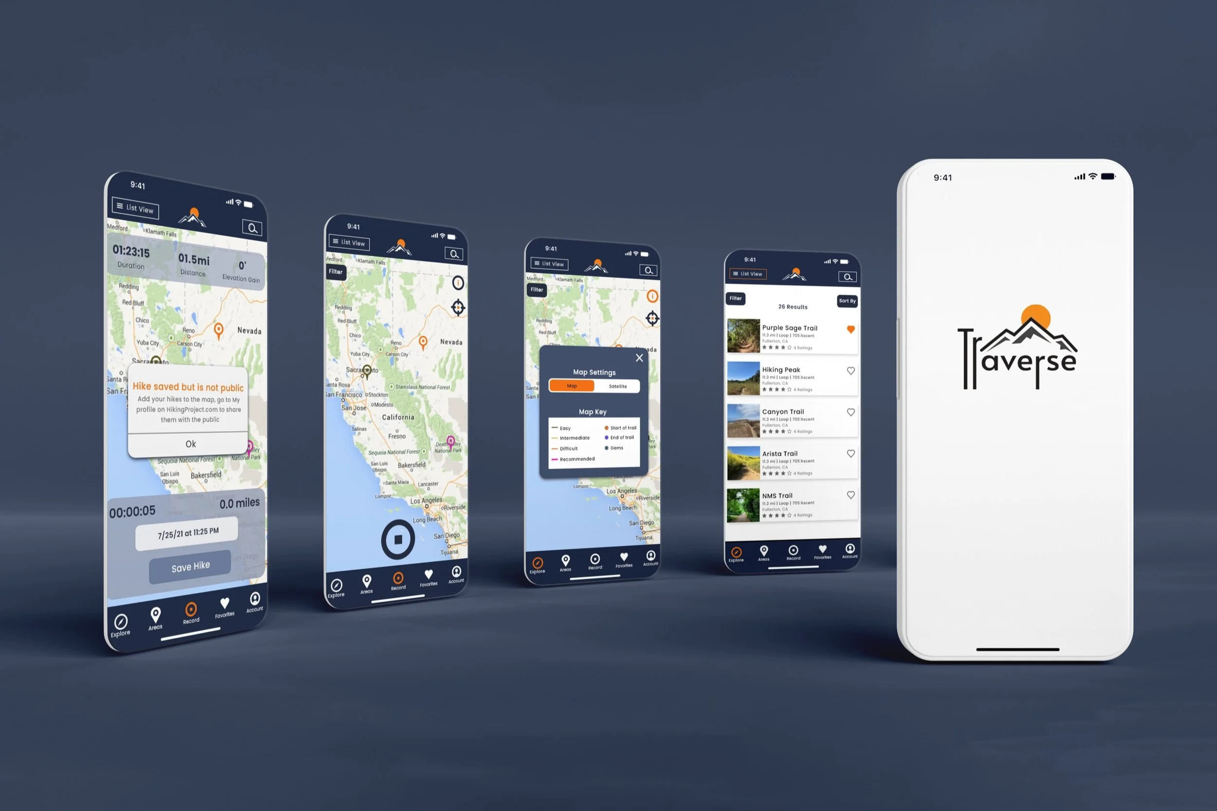
I directed the Traverse brand kit, building a cohesive identity for the redesigned hiking app. The logo features extended descenders on the “T” and “R,” symbolizing trails. The kit includes a refined color palette, logo, favicon, and font set.
Logo Thumbnails
This logo thumbnail process highlights exploration of logomarks, typography, and layouts. Iterations with mountain and sun elements, varied type treatments, and compositions shaped a final logo that conveys outdoor adventure while staying distinctive.
Wireframes
These wireframes outline the app’s structure, mapping navigation, functionality, and user flow. Linked and unlinked versions show the progression from layouts to prototypes.
App Walkthrough Video
This walkthrough video highlights core features, including navigation icons, map search, hike profiles, settings, and the hike recording feature.