
Reinventing Genie Beauty:
Brand & Packaging Designs
Summary
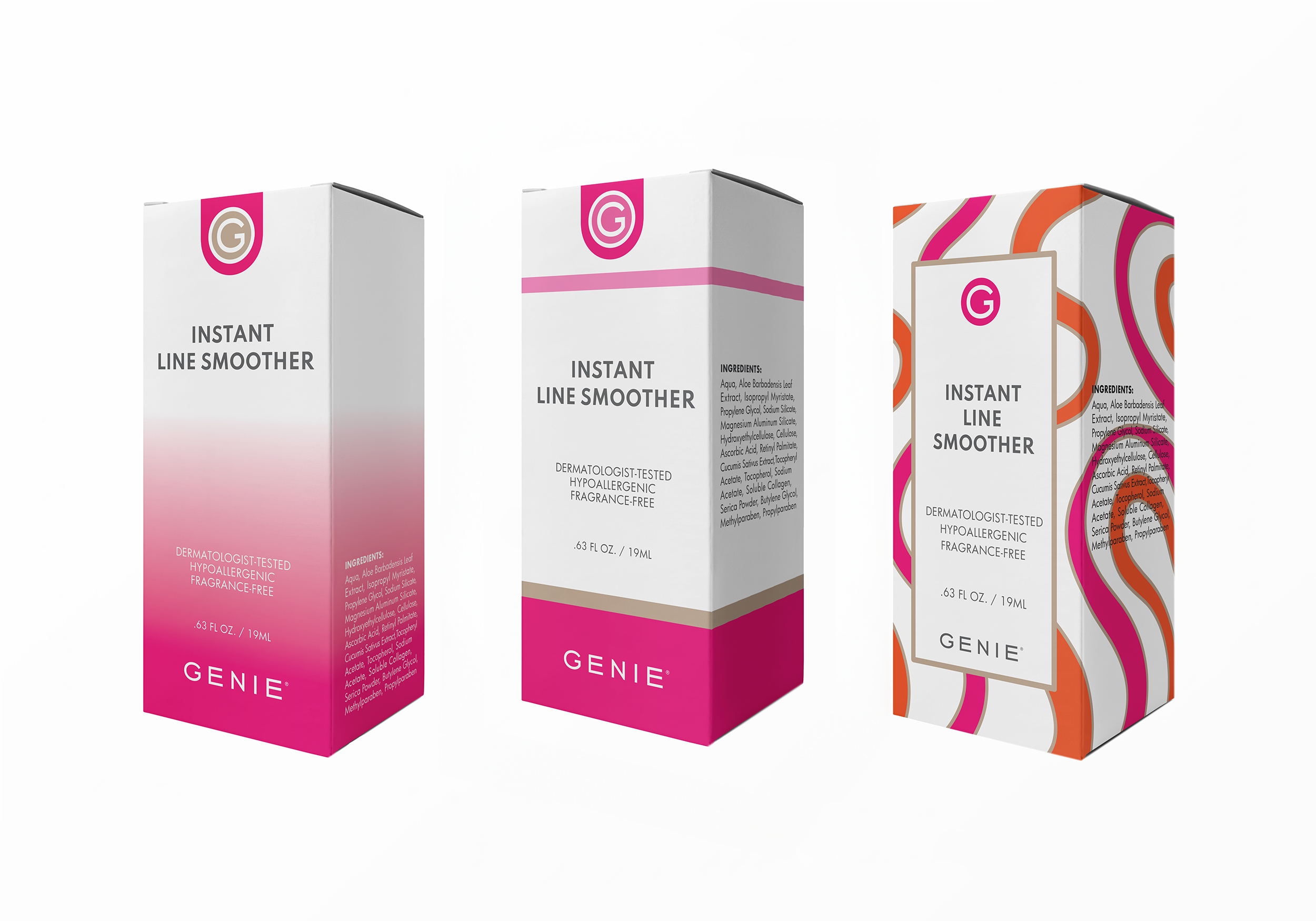
The Genie Beauty Project was a packaging and branding redesign for the Instant Line Smoother product, updating its 20-year-old look to appeal to a younger audience and enhance visibility on retail shelves. At the owners' request, the refresh featured bold pink and orange accents for visibility, complemented by a white base and metallic champagne tone to align with existing champagne product bottles.
My Role
Update the branding and redesign the product packaging to attract a younger audience and stand out on retail shelves.
Branding Update
The branding update for Genie Beauty retained the original metallic champagne color to align with the company’s existing inventory of champagne bottles. Bold pink and orange were chosen as the main colors per the owners' request, aiming to appeal to a younger audience. The champagne tone was incorporated as an accent, shifting from its original prominence. I carefully selected striking yet accessible color combinations, ensuring they enhanced the packaging’s visibility on shelves. The result is a design with vibrant colors and strong contrast, creating a clear, eye-catching presence that stands out to consumers.
The logo update introduced a monogram, creating a youthful and bold symbol that goes beyond simple text. This new monogram is designed to be distinctive and recognizable, offering the company a versatile and memorable branding tool for various platforms and product lines.
Competitive Analysis
I conducted extensive competitive analysis by examining logos and packaging of other beauty brands. I studied design elements, color schemes, and layouts to identify trends and opportunities for differentiation. This research helped guide my approach in creating packaging that would both stand out on the shelves and align with industry standards, ensuring our brand would remain recognizable and appealing within the beauty market while offering a fresh, distinctive presence.
Color Testing Process
The owners specifically requested a pink and orange color combination, aiming to create bold tones that harmonized with their original metallic champagne brand color. To achieve this, I conducted thorough color testing, evaluating various combinations from vibrant hues to softer pastels. This process allowed me to present options that preserved the integrity of the existing champagne while offering a striking, cohesive color palette that elevated the overall branding and ensured strong visual impact.